Comparing Two Periods
Buzzshot offers three ways to compare results with another period: a ready-made panel that never sends you to the editor, a control in the editor that puts a second period beside any figure, and a comparison built into the dashboard itself that every panel on it can follow.
The ready-made way
Add Panel, then Against another period, then Period comparison.
Along with the heading and the note that every preset asks for, it wants three answers:
- Metrics. Tick any of Booking Value, Bookings and People. For each one, the table shows four columns: the period, the comparison, the change and the % change.
- Break down by. Choose Experience, Day of Week or Hour of Day. The table shows one row per value.
- Compare with. Dashboard comparison default follows whatever the dashboard itself is compared with, so one setting moves every panel that uses it. The alternative is a fixed window of its own: Same Weeks Last Year, Same Period Last Year or Previous Period.
After you save, the table shows a row per breakdown value (a row per room, if you left it on Experience), this period's figures against the comparison period, and a total row at the bottom.
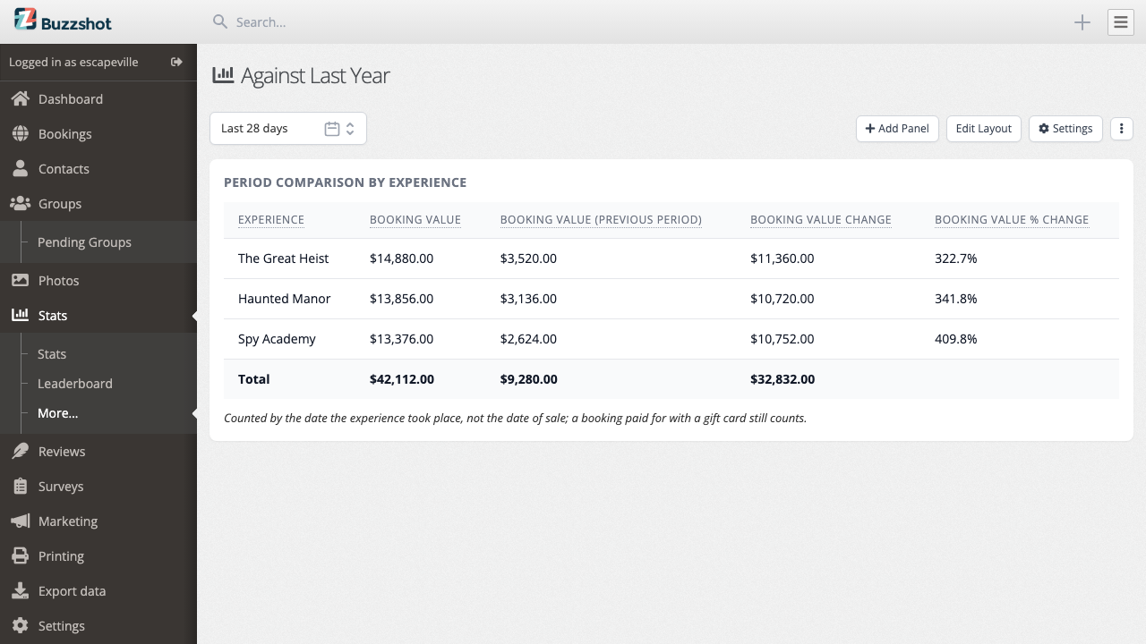
The percentage columns are blank on the total row. This is deliberate. Adding the percentages would give the wrong result, while their average would not show the change for the business as a whole. The amounts beside them do total and give you the business-wide comparison.
The panel counts bookings by the date the game took place, not the sale date. Bookings paid for with a gift card still count.
The dashboard itself can carry a comparison
Turn on Show the comparison picker in a dashboard's Settings and a second control appears beside the date range: Compared with, offering Previous Period, Same Period Last Year, Same Weeks Last Year, or Pick a start date… for a comparison that runs as long as the dashboard's own date range.
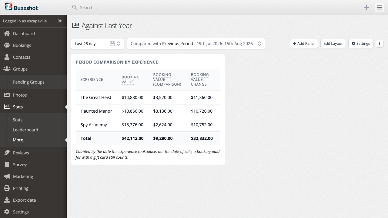
Anyone looking at the dashboard can change it, the same way they can change the date range. Default comparison, also in Settings, sets what it shows before anyone touches it, and what it falls back to if you leave the picker hidden. See Sharing a Dashboard for the rest of Settings.
A panel only follows this if its own Compare with is set to Dashboard comparison default. Anything else on the panel, a fixed window or a metric with no comparison at all, ignores the dashboard's picker entirely. This is the way to put a dozen panels against last month, then move all of them to last year with one change.
Which comparison to pick
Same Weeks Last Year shifts the window back 52 whole weeks, so a Saturday is measured against a Saturday. This is usually the right choice for an escape room. Weekends shape your week, while a calendar year has 365 days, or 52 weeks and one day. Comparing 1 July with 1 July across a year can put a Saturday against a Friday, which distorts the result more than moving the date by one day.
Same Period Last Year puts the same calendar dates against each other: 1 July against 1 July. Use it when the dates matter, such as for a bank holiday or a school half term that falls on fixed dates.
Previous Period compares against the window immediately before this one. A seven-day range is measured against the seven days before it. Use it for week-to-week comparisons, but not for seasonal analysis.
None of these three fits a comparison against a date that is not simply "before" or "a year ago". For that, turn on the dashboard's own comparison picker and choose Pick a start date…, above.
Comparing on a panel you build
Any panel made in the editor can include a comparison. Open the panel, find Compare with at the top and pick a window: Dashboard comparison default to follow the dashboard's own picker, or a fixed window of the panel's own. It starts on Nothing.
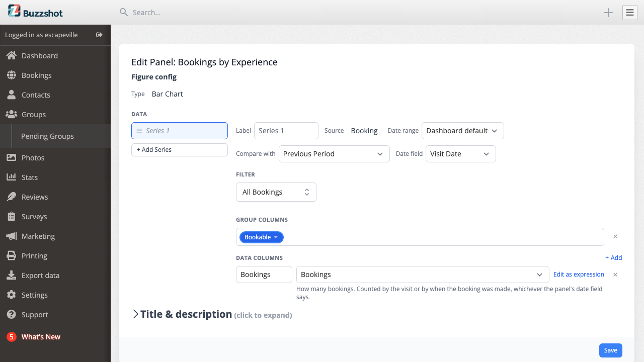
Once a comparison window is set, every aggregate in the editor's suggestions gains a twin marked (comparison), so SUM is joined by SUM (comparison). Pick the twin and that column reads the other period, sitting beside the first.
To work out the change, subtract one figure from the other in a custom expression. Divide that by the comparison figure and set the column's format to Percentage for the percentage change. Both are ordinary calculated columns, so a chart can draw them and the total row can total them.
When the control is greyed out
Compare with greys itself out rather than letting you build something that cannot be shown. Hover over it to see why.
The panel lists individual rows. A table of every booking, with a booking reference in it, has nowhere to put a second period. Last year's bookings are different bookings, not a second column for the current bookings. Comparisons need totals, so either wrap each data column in an aggregate such as SUM, or give the panel a group column so it totals per row. A summary row along the bottom is not enough on its own.
The panel reads slots. Occupancy, Seats Taken and Seats Offered are worked out slot by slot, and a second date range would be ignored. Rather than show you this period's numbers under last period's heading, Buzzshot turns the control off. To compare how full you were, put two panels side by side and give each its own Date range.
When the grouping and the comparison disagree
A chart grouped by day, week or month cannot use every comparison window. The two periods must line up group by group.
Same Period Last Year cannot be grouped by date at all. A calendar year is 365 days or 366, so no run of days, weeks or months lines one year up with the other. Grouping by something that is not a date, such as Experience or Day of Week, is still fine.
Previous Period, Dashboard comparison default and a custom start date can group by hour, day or week, as long as the gap between the two windows is a whole number of them. They can never group by month or year, because months vary in length and no fixed shift is a whole number of them.
Same Weeks Last Year shifts by exactly 52 weeks, so it groups by day and by week. Use this comparison for a chart.
The two dropdowns limit each other's options, so an invalid combination is usually not offered.
See also
- Building a Panel from Scratch
- What the Numbers Mean
- Creating a Dashboard
- Sharing a Dashboard: Settings, where the dashboard's own comparison lives