Building a Panel from Scratch
The panel editor builds anything the ready-made panels can, and a great deal they cannot: a figure filtered to one room, a column you have worked out yourself, a chart with four lines on it.
Most people never need it. Check What the Numbers Mean first. The panel you need may already exist under a name you did not recognise.
Two ways in
Add Panel, then one of the six entries under Blank (Advanced) at the foot of the category list. You pick the shape and get an empty editor.
Or Edit Panel on a ready-made panel, then Switch to advanced….
The second route shows a warning. While the panel is a preset, it keeps its questions and regenerates itself when you change an answer. Saving it in the advanced editor turns it into a custom panel. The questions go, you can write the explanatory note, and Buzzshot stops regenerating it. Your figures do not change. Leaving the advanced editor without saving leaves the preset exactly as it was.
The editor
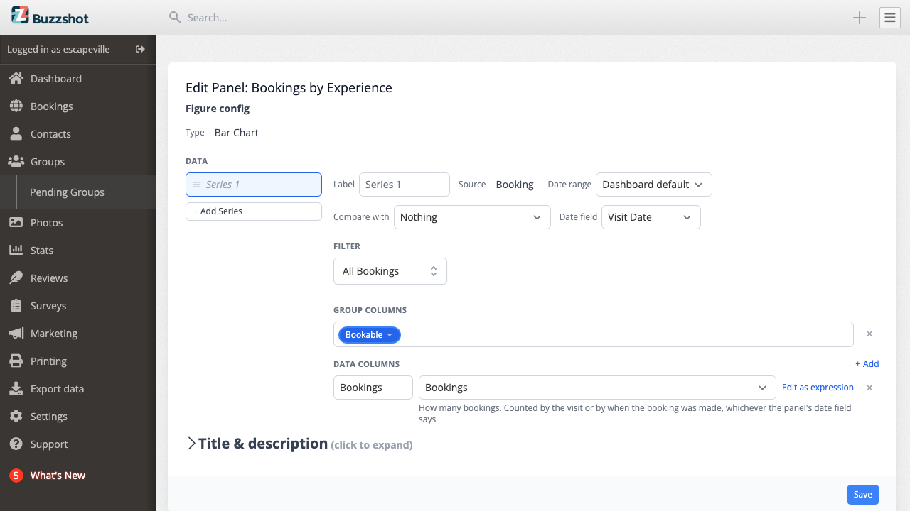
Along the top:
- Type. Big Number, Table, Line Chart, Bar Chart, Pie Chart or Pivot Table. You can change it until the panel has columns; after that, clear the columns first.
- Source. Which list of things the panel counts. Booking is one row per booking, Order one row per order, Slot one row per time slot, and Ledger one row per movement of money. The source decides which fields and metrics you can use, so choose it first.
- Date range. What period this panel reads. Dashboard default follows the picker at the top of the page. A fixed window pins the panel and ignores the picker: Today, Last 7 Days, Full Previous Month and so on. This is how one dashboard shows today beside the month to date. Previous Period and the two last-year options are still measured off whatever the picker says.
- Compare with. A second period to put beside the first. See Comparing Two Periods.
- Date field. Which date the period applies to. Bookings offer Visit Date, Date Booked and Order Date and default to the visit; other sources offer their own. The control is hidden when the source has only one date to offer, and on line charts, which take their date from the time axis.
Below these settings sit Filter and the two column lists.
Group columns and data columns
A panel uses a table structure even when it is drawn as a chart. Group Columns break it down into one row per distinct value. Data Columns hold the figures.
On a bar chart the group column is the axis along the bottom and the data column is the height of the bars. On a line chart the group slot is labelled Timestamp, because a line has to run along time. A big number has no group column at all.
+ Add puts a new column in either list. Drag the handle on the left of a row to reorder. The × on the right removes it.
Choosing what a column shows
A data column starts as a dropdown of ready-made metrics: Net Payments, Booking Value, Unpaid, Occupancy and the rest. Each has a line underneath that explains what it means. Pick one and Buzzshot adds the full calculation. For most panels, that is all you need.
Group columns skip the dropdown, because no metric makes sense as a breakdown. They go straight to the fields, where you pick what to group by. For a date you also choose how to chop it up, and the two families do different jobs. Truncate keeps the date: truncating to Week gives you one bucket per week of the year, which is what a chart over time wants. Extract throws the date away and keeps the part you asked for: extracting Day of Week puts every Monday in one bucket, which is what "how do Mondays go?" wants.
Writing your own calculation
Custom expression…, last in the metric dropdown, opens an empty expression editor. Edit as expression next to a chosen metric opens the editor with that metric already filled in. This is often the easier starting point. Take Booking Value, open it and change what you need.
An expression can hold any field on the source, numbers you type, the four arithmetic operators plus min and max, and the aggregates SUM, AVG, MIN, MAX, COUNT TRUE, COUNT FALSE and a bare COUNT for counting rows. Start typing and Buzzshot suggests what fits.
A metric inside an expression appears as a green pill under its own name, not
as the arithmetic behind it. A grouped panel therefore reads
SUM(Booking Value) instead of showing a line of algebra. Hover over the pill
to see what it contains. The ⤢ beside it opens the parts for editing.
The copy and paste buttons move an expression between columns, panels and dashboards. Buzzshot refuses the paste and gives a reason if the destination source does not have a field that the expression needs.
Filtering a panel
The Filter section narrows what the panel counts. It uses the same filter builder as the orders and bookings lists, so you can pick out one room, one product or one order status. Each source brings its own filters: the money one can only be narrowed by the order a payment belongs to.
Filtering is the most common reason to move beyond the ready-made panels. A gallery panel covers the whole business by design. Showing "Net Payments" for only The Vault takes about two minutes.
Tables and grids
A table gets a Table section at the foot of the editor:
- Summary row along the bottom, with a heading you can change from Total.
- A column joins that row only once you say how it should total, using the Totals dropdown beside the column.
Turning on the summary row shows every row instead of one page at a time. A total for one page would not cover the full table.
A pivot table gets a Pivot table section:
- Summary row along the bottom and Total column down the side.
- Colour cells by value, which shades the grid from pale to blue so the busiest parts are easy to spot.
The summary row and the total column work on the cells, not on the rows underneath, and the Totals dropdown beside each column decides how. Average is right for a percentage: an Occupancy grid gives a quiet hour the same weight as a busy one. A count wants a sum instead, which is what the ready-made People grid uses.
Several series on one panel
Bar charts, line charts and big numbers can hold more than one series. + Add Series adds another, and each gets its own source, dates, filter and columns.
Two lines on one chart, this year against last, is the common use. Several big numbers in one panel sit side by side at the same size, which is how a row of related totals gets made.
Headings and notes
The Title & description section is collapsed at the bottom of the editor. It holds three fields:
- Heading, above the figure. Leave it blank to hide it.
- Description, a block of text above the figure.
- Footnote, a block below it. On a ready-made panel this is where the italic explanatory note lives. Once you have switched to advanced, it is yours to write. If your panel counts something unusual, explain it here for the next person who reads it.
If the panel will not save
Buzzshot checks the whole panel when you save and refuses anything it cannot draw. The message names the problem. The usual causes:
- A data column with no calculation in it.
- A line chart whose group column is not a date.
- Mixing individual rows and totals in one figure.
- A grouping the comparison window cannot line up with. See Comparing Two Periods for which combinations work.
See also